Tuesday, 23 March 2010
Feedback from S1-22 on final cut
We think that S1-21 have made a lot of improvements compared to their rough cut. The soundtrack we thought made the opening more successful and conventional to a thriller. The credits fitted in really well with the editing of your work making it interesting to look at. The low angle shot of Adam worked really well to show that he is the antagonist. Overall, we think that the final version fits the conventions of a thriller opening :)
Friday, 12 March 2010
feeback of feeback
As we had not completed our editing we knew what we had to improve, the feedback we received we already knew and yet to have to improve. We possibly need to move around our footage for it to be more fluent and flow together better.
Feedback of rough cut from S1-22
We thought that the narrative the was clear Jenny was obviously in peril. The location was good but the change from being in the corridor to going outside was a bit random maybe moving to a classroom instead could've been more effective. you could use more transitions and fades maybe use these when you add credits and a title.the lighting in the corridor was effective with the sun glow through the windows.
You could edit out the green section on final cut express to eliminate sound of the cleaner and you could go over this with the soundtrack. but using the cleaners noise would give you diegetic and non diegetic.
The camera angles were good. the low angle shot of Adam was effective and made him look powerful and in control.
feedback s1-23
There were no credits in this film which is required in this task.
There were several flaws in the filming, first off is the continuity of the characters clothes and location is bad because they are wearing different clothes in the same scenes and there is a plot holes because the characters change from inside to the outside without anything inbetween
There were several flaws in the filming, first off is the continuity of the characters clothes and location is bad because they are wearing different clothes in the same scenes and there is a plot holes because the characters change from inside to the outside without anything inbetween
S1-24
We think that is was good being in black and white, we felt that it fitted the genre well.
It didn't flow well with all the jump cuts between shots. The shots were well used but need some transitions for it to blend better.
The narrative was hard to understand with all the jumping between shots. The locations were good but it was weird that it went from inside to outside then back.
There was a lot of background noise during the forest section with the people filming laughing. A music track would be useful to cover the noise.
Titles would need to be added to make it look more serious.
The mise-en scene didn't fit as the main character wore a different top from the start and the finish.
The use of colouring was effective, we thought that the choice to put the film in black and white made it creepier. It was obvious who the protagonist was and who the antagonist was comparison with one another. The hand held shot made the fil very chaotic and the random shot of the train was effective. From the high angel shots of the girl you can tell that she is in peril which conforms with conventions of a thriller. The use of diagetic sound was effective. We really enjoyed the idea of the film and there were obvious clues that the protagonist was going insane.
On the other hand we liked the shots but they could improve by being put together properly so as they look fluent and follow one another properly. The film would also be improved by some music which would add more tension to the film although we are sure this will be added soon.
On the other hand we liked the shots but they could improve by being put together properly so as they look fluent and follow one another properly. The film would also be improved by some music which would add more tension to the film although we are sure this will be added soon.
FEEDBACK - S1-20
It starts off with the protagonist in the corridor and we get an establishing shot to show the location where this opening is set, we also get introduced to the antagonist through the edits this is good because we clearly see a protagonist and antagonist. There is a good shot where we see the antagonist in the window and the protagonist looking scared.
You can tell the opening is filmed in a college because there are computers and a sign that says long road on it apart from this the location is good for this thriller opening.
The sound is a bit jumpy so is the editing also there are no titles or credits however the black and white setting makes a good thriller effect.
Tuesday, 9 March 2010
Tuesday, 2 March 2010
Evaluation Questions
The following questions must be answered in your evaluation PowerPoint:
1. In what ways does your media product use, develop or challenge forms and conventions of real media products?
2. How does your media product represent particular social groups?
3. What kind of media institution might distribute your media product and why?
4. Who would be the audience for your media product?
5. How did you attract/address your audience?
6. What have you learnt about technologies from the process of constructing the product?
7. Looking back to your preliminary task, what do you feel that you have learnt in the progression from it to the full product?
Monday, 1 March 2010
BLOG OF THE WEEK ANALYSIS
In the blog of the week they have included the dates of their deadlines, i think this is a good idea as they always will have it there to remind you. They have done well to analysis the small details in their opening sequence, giving examples of how to go about creating a certain atmosphere. having mugshots of the actors gives you a good visual analysis. They have screen grabs and photos that they have taken themselves of ideas where they are going to film
Poster Anaysis
SAW;
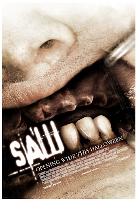
This poster has a strong thriller theme we can see this by the style of the text all blurry and confused. The washed out color hints at a dark plot. Only having three teeth remaining and dentistry instruments grasping his mouth shows that this person could have been tortured. This off red/brown color possibly represents old dry blood. The slanted writing makes the film seen quirky. In addition the film is 'opening wide this Halloween', the image reflecting the 'opening wide' part, also the film is coming out in Halloween, straight away it has a scary aspect.
RISE;
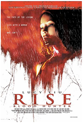
Straight away this poster shouts out that it is thriller. The blood dribbling down the girls face represents that, still we don't know if it her blood or not. It almost looks like it is raining blood. We can also tell that it is thriller because of the title 'blood hunter', hunter hints that it actually has a plot rather then a horror film is all about gore. The red drooping over the white, like its ruining it. there are also cracks in the background giving this poster an unsteady feeling leaving the audience no knowing what its going to happen
Inspiration
SAW 1;
Our inspiration for our psychological thriller consists of Saw 1, this is because some scenes from our opening sequence and clips from the film relate well to each other. The sudden change of shot types and flashbacks inspired us to go a similar direction.
This trailer is an example of what we are wanting to aim for. Throughout the trailer, you are able to stand a bit more of the story and whats going on, slowly letting you in. There isn't a soundtrack, just the sound of a camera flashing. This is the only light you can see with, at the beginning most of the scenes are pitch black.
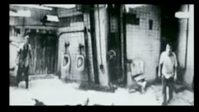
This screen grab shows a clip from the film of a the hidden video camera in the room. This 'old fashioned' style of shot gives a more creepy atmosphere. During the film you can only hear people talking, finding out more and more about the plot. There are many different camera shots involved, such as close up; giving a more intense feeling and long shot so you able to see the location. You never are able to see the person/thing who is in control. There is many hidden mysteries still to unravel, making you want to watch more.
The inspiration we are taking from this is the whole mystery of it, slowly understanding more. The sudden flashes of clips show this well. Overall this will put the audience on the edge of their seat. The camera flashes we found were a good idea and may investigate into doing that ourselves in our thriller.
Subscribe to:
Comments (Atom)